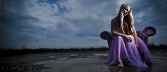
The interplay of highlight and shadow is one of the most powerful tools a photographer has to play with. This interplay is a fine balance sometimes, but it is often at the heart of some of our most interesting and compelling images. Where many photographers often fail is in keeping this at the forefront of their lighting layout, remembering that both are needed to create the notions of texture and form in a two-dimensional image. In fact, where some photographers get this wrong is in their tendency to overlight. What do I mean by this? Its quite simple. There is often the tendency to believe that one light is too few and the technique too simple for anything dramatic or truly photographic to emerge. It is a fallacious tendency that often ruins the best of creative intentions. Just because a technique is simple it does not mean that it lacks creativity or impact. Keeping it simple is the difference between B.B. King and Yngwie Malmsteen. Both are very talented, but BB only plays four notes to Malmsteen's four hundred. That said, I could listen to BB for hours.
Yesterday found me once again out on a Creative Photo Workshops shoot. This time our model was Kelly Jean, a model with whom I had not worked since my original workshops some time back. Our location was yet another abandoned, ruined old structure somewhere in the middle of nowhere, the whereabouts of which I cannot divulge. Glynn - my partner in crime - and I saw this old armchair in the rubble and moved it smack bang into the middle of a concrete slab on this property. The starkness of the scene and the presence of some rather wonderful clouds gave us an idea to create the images you see here. You will see me blogging quite a bit about shoots such as these now that we have a new magazine in the planning and video tutorials to create for our new website. More on that to come...

 |
| The real light on the day |
Most of what I do for myself and teach our customers at photography workshops in terms of off camera flash is all based around using one flash, one single point of illumination. And why not? The entire planet is lit by one main light source by day. This one light source creates enough shadow and highlight in the world around us that we can with our own eyes tell shape, form and texture. Why not keep this same lighting principle in our photographs - at least as a starting point?
The images you see in this blog post were all created using one small handheld flashgun connected to FlashWave III triggers and receivers. Using simple guide number calculations that we teach at our Creative Flash Photography workshops, we can quickly establish the aperture for our exposure. Its a simple matter then of selecting the corresponding shutter speed to either match the ambient, or underexpose it. I usually opt to underexpose it to further highlight the subject. In this way, you are able to produce dramatic images straight from the camera. As you can see from the behind the scenes photographs taken by Natasha from Black Tulip Photography, the reality looks very different to the end product. Nevertheless, the images from the camera were very different due to the added flash and the choice of exposure for the ambient. Sure, each of these images has clearly seen a few minutes of PhotoShop. But the images out of the camera needed to be what they were in order for these finished products to have emerged.
The images you see in this blog post were all created using one small handheld flashgun connected to FlashWave III triggers and receivers. Using simple guide number calculations that we teach at our Creative Flash Photography workshops, we can quickly establish the aperture for our exposure. Its a simple matter then of selecting the corresponding shutter speed to either match the ambient, or underexpose it. I usually opt to underexpose it to further highlight the subject. In this way, you are able to produce dramatic images straight from the camera. As you can see from the behind the scenes photographs taken by Natasha from Black Tulip Photography, the reality looks very different to the end product. Nevertheless, the images from the camera were very different due to the added flash and the choice of exposure for the ambient. Sure, each of these images has clearly seen a few minutes of PhotoShop. But the images out of the camera needed to be what they were in order for these finished products to have emerged.
It is quite evident in these images that one light was enough to create the desired, ethereal effect. No additional lighting was required. In fact, it wasn't even really considered, which is odd, seeing as we brought six or seven flashguns with us. I always start with one light, adding more only if they are needed. I may modify that light with a Honl grid or some other accessory, but I find that usually I start and finish with one. One light is always my starting point in the studio too. Where many photographers who are learning studio lighting techniques err is in their enthusiasm for turning on every flashhead in the place to see what happens. A word to the wise if you don't mind. Turn on one light and then see where you need another one - if you do. Keeping it simple is usually the key to success in terms of lighting.God did.It works.


1 comment:
Love the surreal look..it generates a most interesting mood. Excellent stuff guys! Razz.
Post a Comment